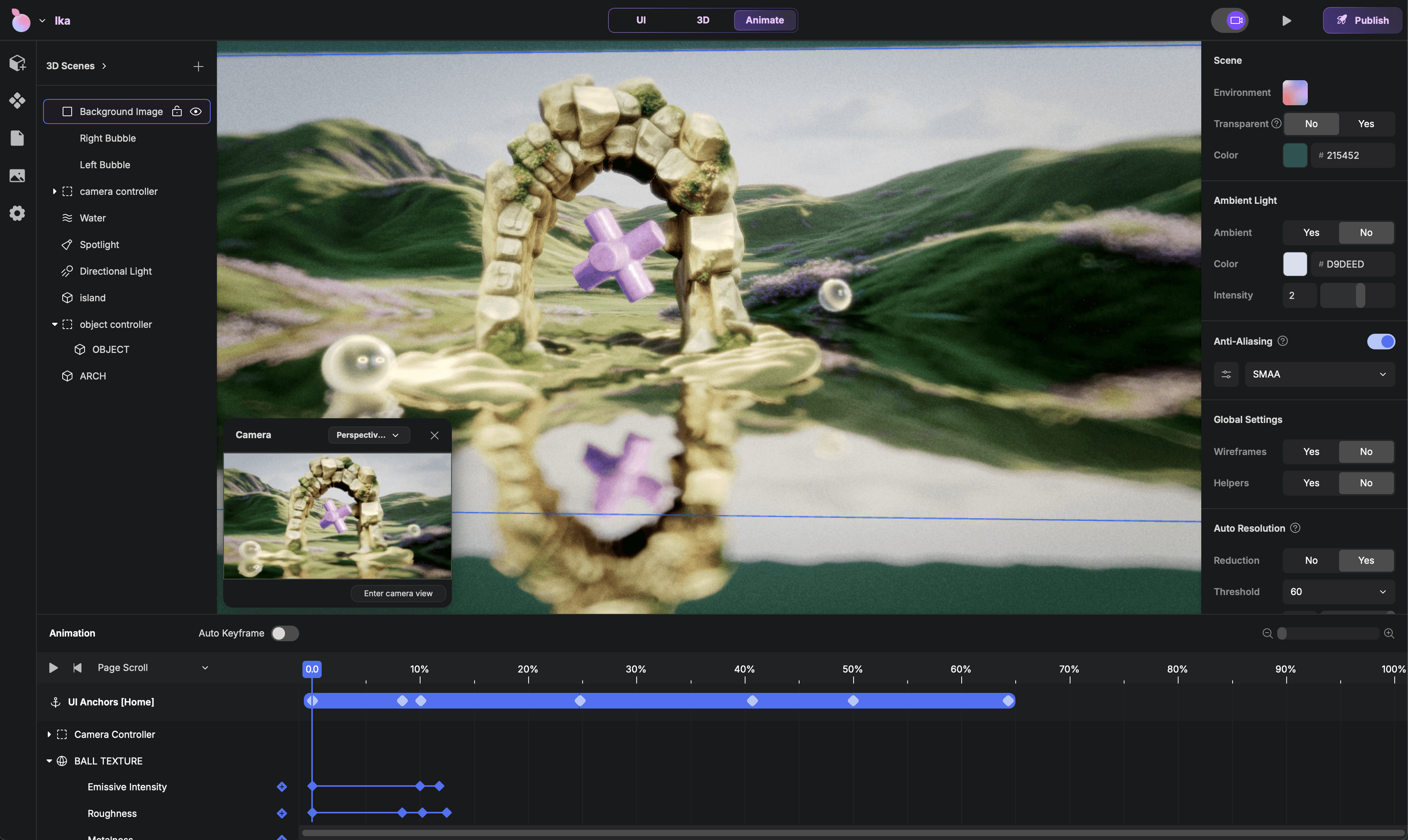
A builder for interactive websites combining HTML content, 3D scenes, animation, and AI — and the design challenges that came with making all of it feel like one coherent product.

Founding Product Designer

2023 - 2026

Product Design · Product Architecture · Builder UX · 3D tooling · Animation Systems · Monetization

Product Design · Product Architecture · Builder UX · 3D tooling · Animation Systems · Monetization

What
What
What

Sole product designer on PeachWeb — a no-code builder combining HTML layout, 3D scenes, scroll animation, and AI generation in a single product.

Team
Team
Team

8 people. I owned all design: Figma, interaction specs, and engineering tickets. Collaborated closely with a designer-CEO who drove product vision.

Core Challenges
Core Challenges
Core Challenges

Four tools' worth of mental models needed to feel like one coherent product. Every design decision on one layer had structural consequences for the others.

Hardest Problem
Hardest Problem
Hardest Problem

Scroll-based 3D motion broke whenever page layouts changed. There was no prior art for this in a no-code context — I had to invent the framing (Anchors) before designing the solution.

Other Decisions
Other Decisions
Other Decisions

Restructured page hierarchy before multi-scene complexity made it irreversible. Designed a site-level freemium model that gates publishing, not creation. Scoped AI as an editable starting point, not a magic button.
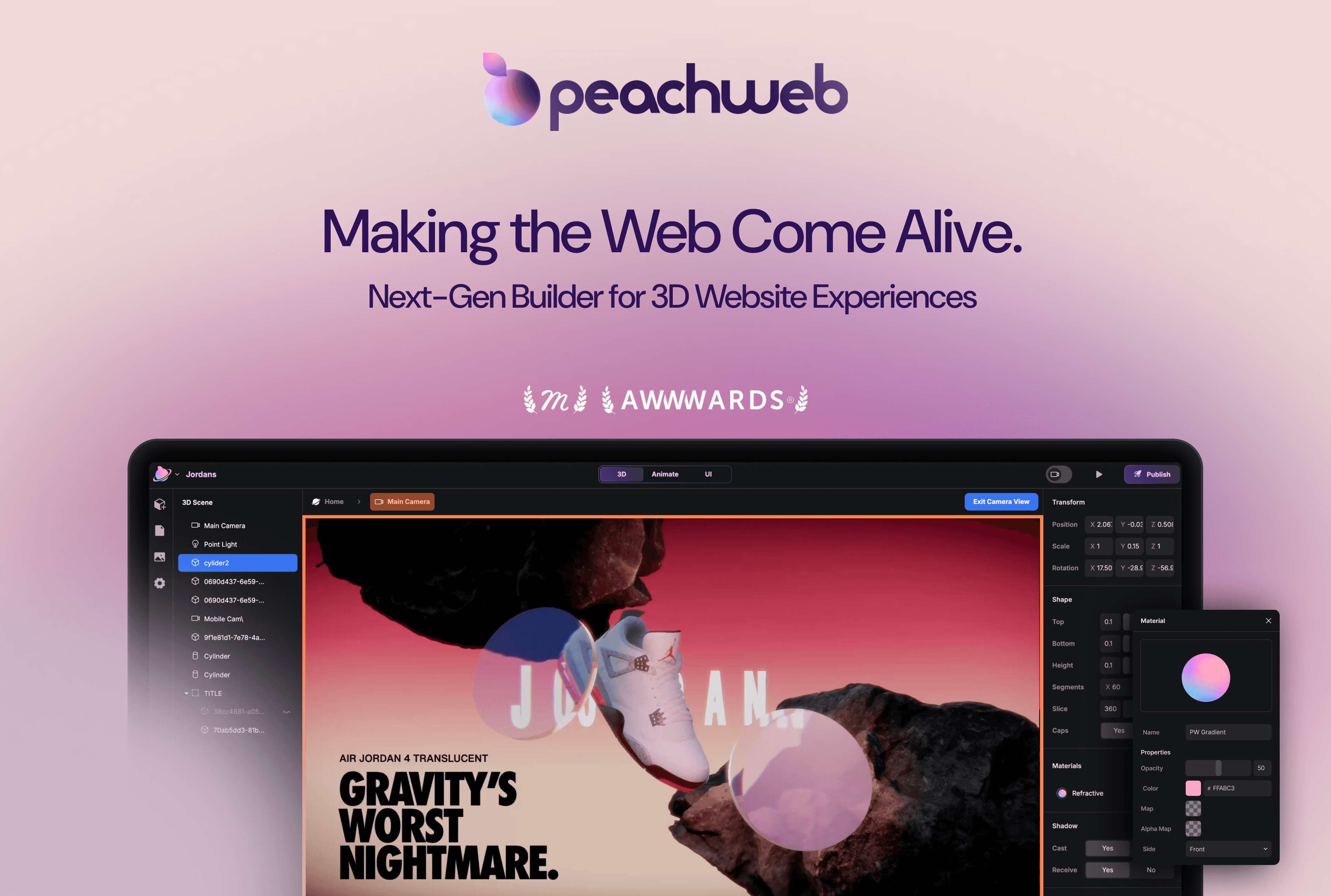
Overview

PeachWeb grew out of an agency I was part of. When we transitioned into building a product, I became the sole designer on a team of 8. The CEO was a designer himself — some features came fully formed from his vision, my job was to make them shippable. Others I owned end-to-end.

I owned the full design stack with no team to delegate to or align with.

The Challenge

Four tools' worth of mental models — layout, 3D, motion, AI — needed to feel like one product. Every decision on one layer had structural consequences for the others. Less a UX problem, more a product architecture one.

A Connected System

I approached it as three connected layers:
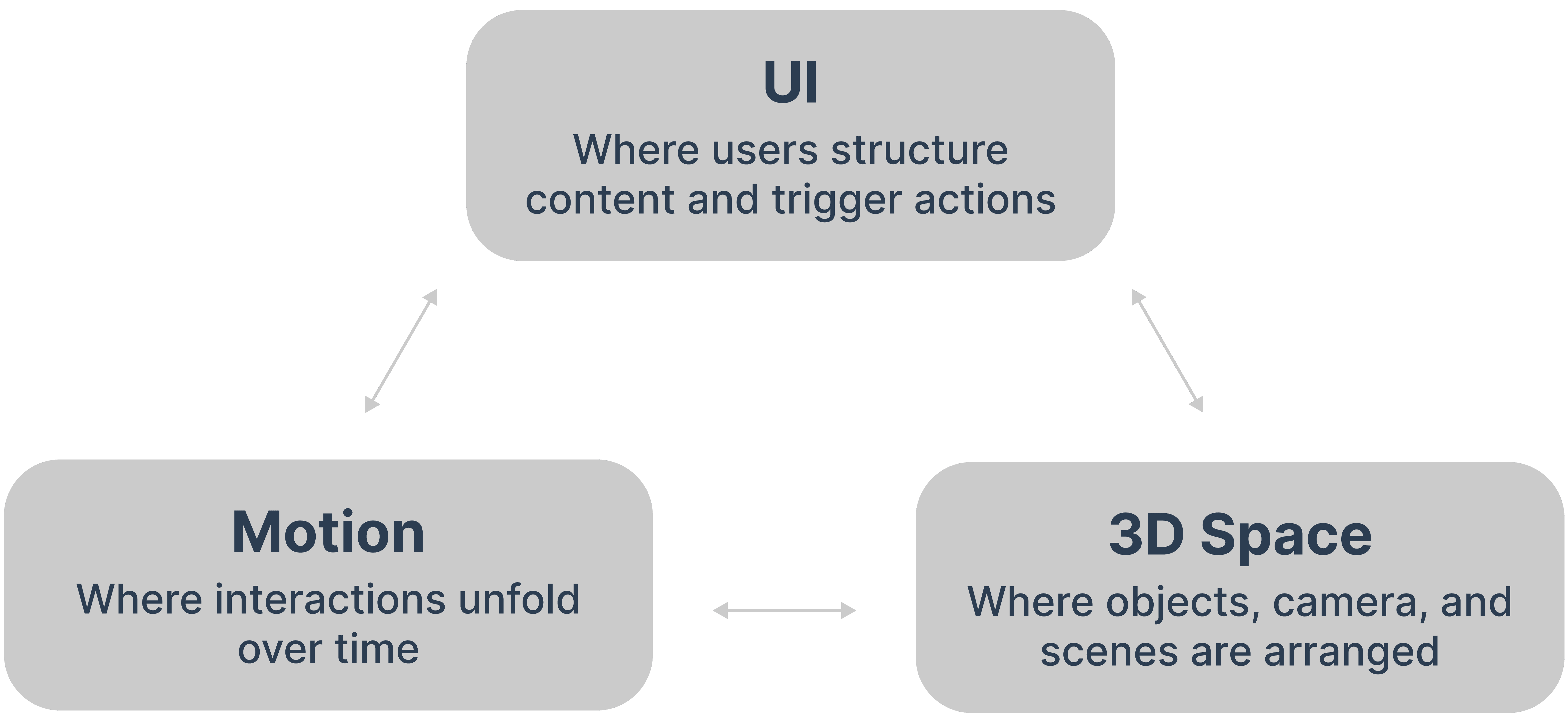


Changes in one needed to translate clearly into the others.


Key Decisions

DECISION 01 — HERO

Inventing Anchors: when scroll-mapping broke down
3D animations were mapped to page scroll length. When layouts changed across breakpoints, the timing broke. The real problem wasn't scroll math — motion had no semantic relationship to page structure.

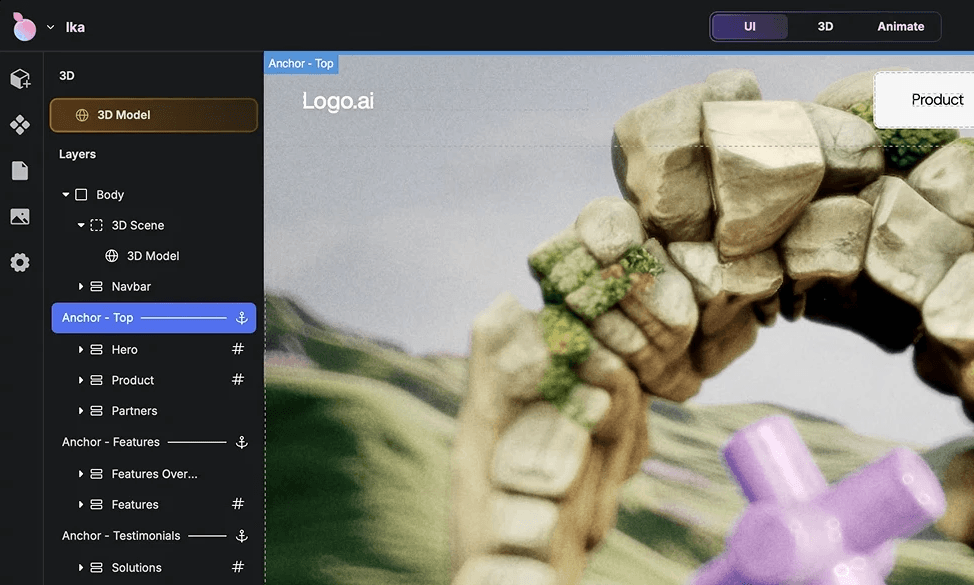
I introduced Anchors: named reference points in the page structure that animations attach to. Instead of "start at 40% scroll," users say "start when the user reaches the Introduction section." Motion becomes structural, not numerical.

The UX required solving two surfaces at once — placing anchors in the page editor and connecting them to the 3D timeline — without making them feel like separate systems.


MY ROLE ON THIS DECISION

Identified the failure mode through user research. Defined the Anchor concept from scratch — no prior art existed. Prototyped with an engineer to validate the 3D timeline could attach to structural points. Designed the final UI across both surfaces.

Looking back, the most valuable skill I developed on PeachWeb was learning to distinguish between execution problems and framing problems. Most of the hardest work wasn't designing UI — it was deciding what the right question was before designing anything. The Anchors system is the clearest example: the solution looks simple in hindsight, but finding it required stepping back from "how do we fix the scroll timing" to "why is scroll the right unit of measurement at all."

Working with a designer-CEO also taught me something specific about operating in high-trust, high-ambiguity environments. The dynamic required me to be a strong executor on features he cared deeply about, while also being proactive enough to surface structural problems he wasn't looking for — like the page hierarchy issue, which he hadn't flagged as a priority. Navigating that balance without a design team to validate my thinking made me more rigorous about how I framed and documented my reasoning.


WHAT I'D DO DIFFERENTLY

Earlier and more structured user research. We were a small team moving fast, and I leaned heavily on the CEO-as-user for signal. That worked for some decisions and created blind spots for others. I'd push harder for even lightweight usage sessions with external users from the start.

Anchors defined in page structure

The same anchors mapped into motion

DECISION 02

Designing a monetization model for a non-standard SaaS
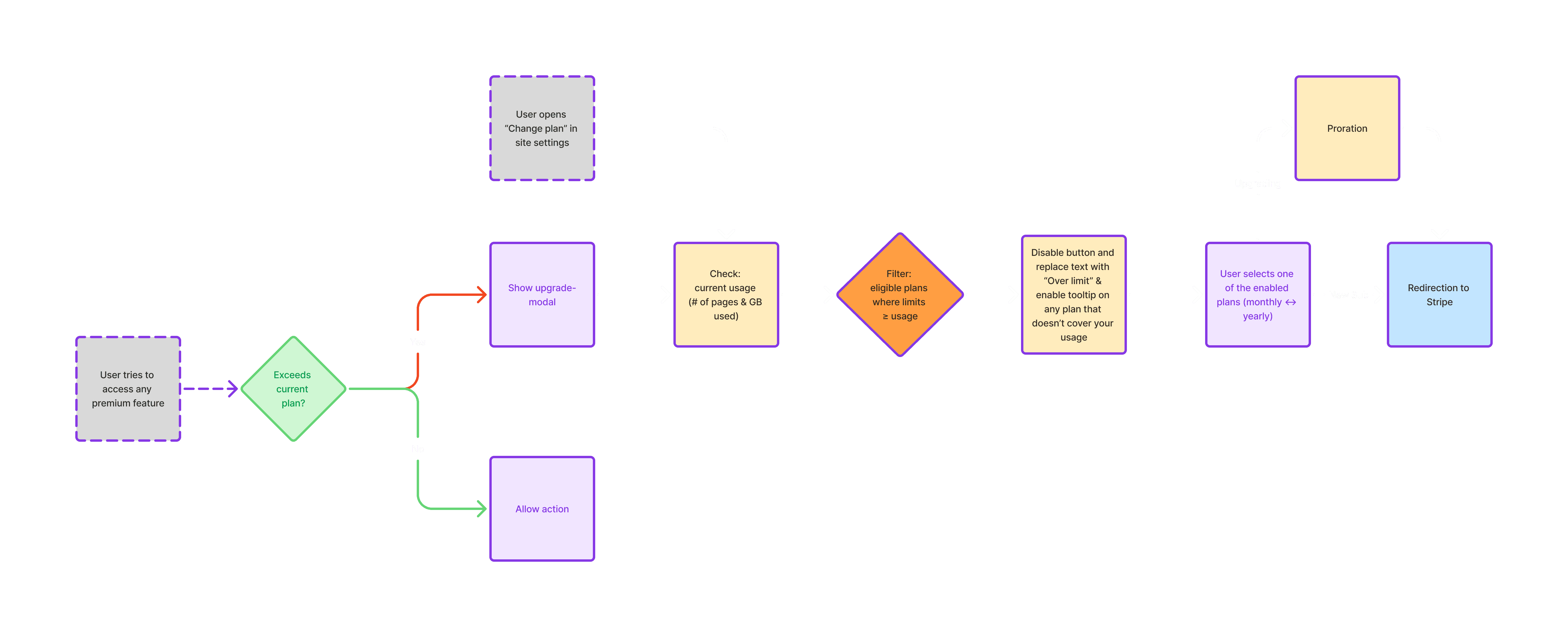
PeachWeb's plans applied at the site level, not the user level — one user could have five sites at different tiers. The question was whether to gate premium features before or after the user tries them.

I advocated for gating at publish, not at creation. Build freely, upgrade when you want to go live. Premium features were marked in the builder so nothing came as a surprise.


MY ROLE ON THIS DECISION

Defined free vs. paid boundaries with the CEO and Dev engineer. Designed the premium labeling system, first-use warning flow, publish-gate upgrade experience, and site-level plan architecture.

Looking back, the most valuable skill I developed on PeachWeb was learning to distinguish between execution problems and framing problems. Most of the hardest work wasn't designing UI — it was deciding what the right question was before designing anything. The Anchors system is the clearest example: the solution looks simple in hindsight, but finding it required stepping back from "how do we fix the scroll timing" to "why is scroll the right unit of measurement at all."

Working with a designer-CEO also taught me something specific about operating in high-trust, high-ambiguity environments. The dynamic required me to be a strong executor on features he cared deeply about, while also being proactive enough to surface structural problems he wasn't looking for — like the page hierarchy issue, which he hadn't flagged as a priority. Navigating that balance without a design team to validate my thinking made me more rigorous about how I framed and documented my reasoning.


WHAT I'D DO DIFFERENTLY

Earlier and more structured user research. We were a small team moving fast, and I leaned heavily on the CEO-as-user for signal. That worked for some decisions and created blind spots for others. I'd push harder for even lightweight usage sessions with external users from the start.

Payment flow chart

Publishing and upgrade logic depended on actual site usage, not just feature access.
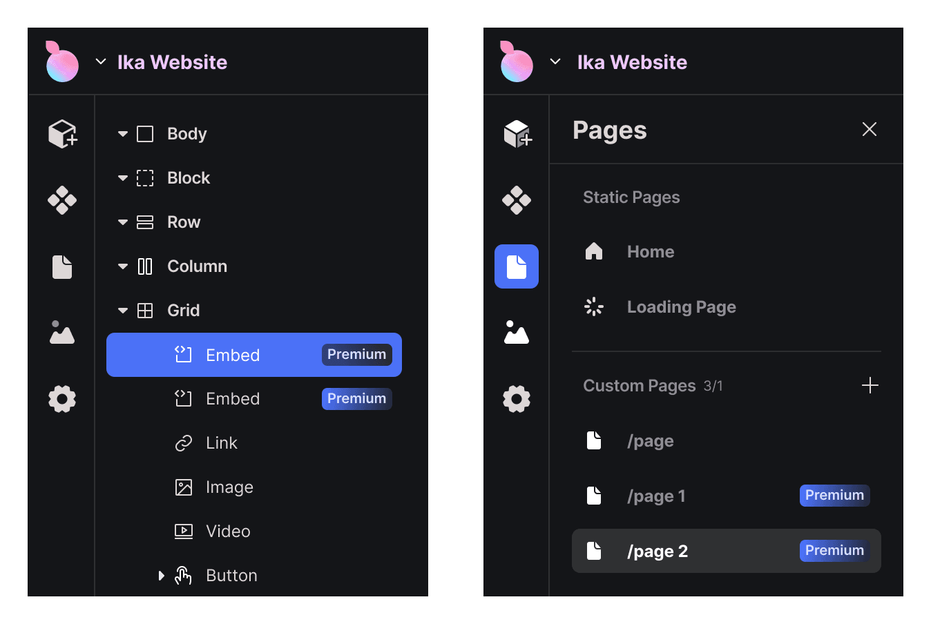
Premium Layers
Premium Layers

Premium features were visibly marked in the builder.
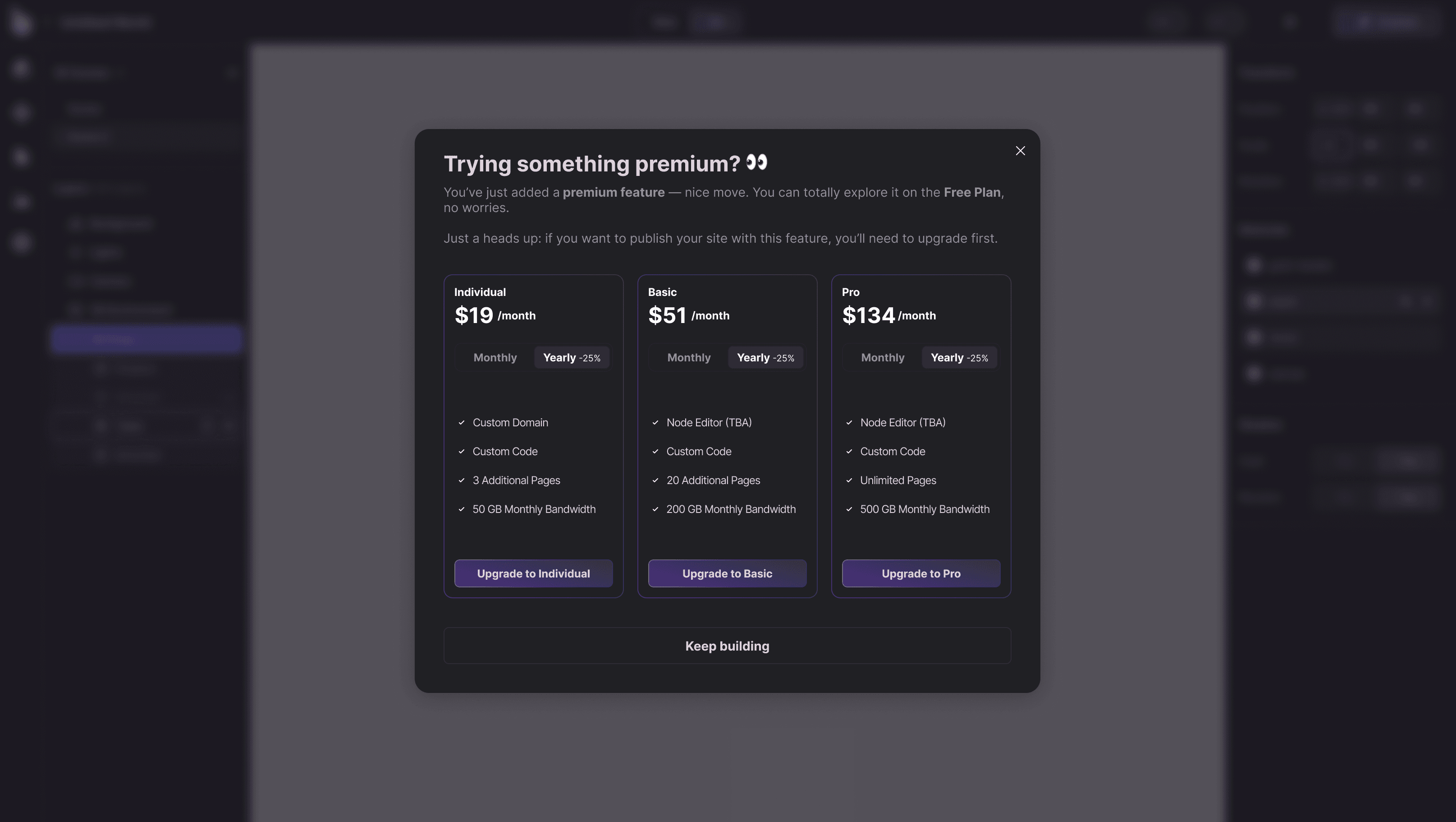
Modal warning

Users were warned the first time a premium feature affected publishing eligibility.

DECISION 03

Restructuring the page hierarchy when it stopped making sense
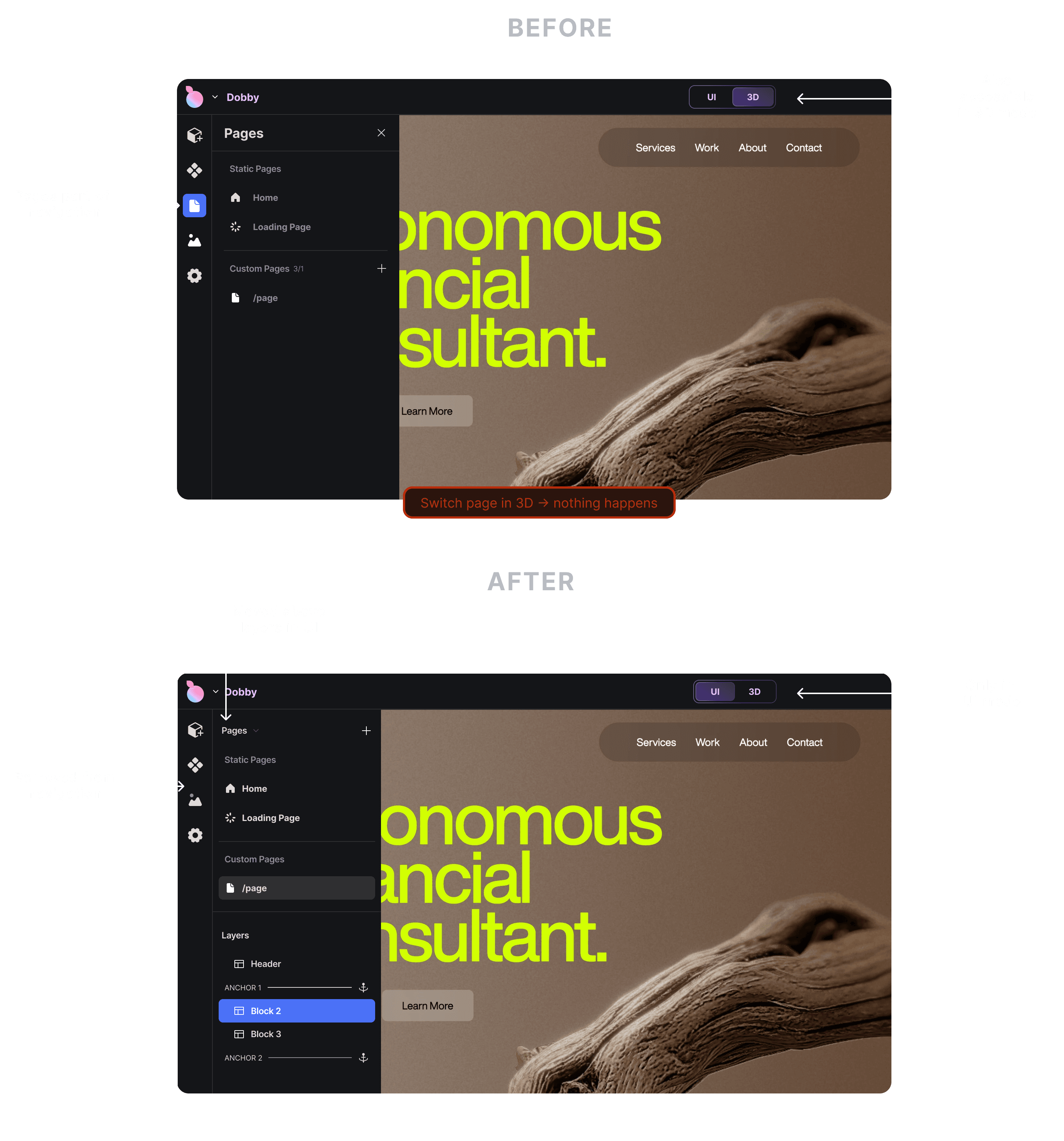
PeachWeb has two distinct modes: UI and 3D. Early on, Pages lived in both — accessible from the left panel in either mode. The problem: switching pages while in 3D did nothing. The UI was offering an action that had no effect.

As the product evolved to support multiple 3D scenes, the structural mismatch became impossible to ignore. Pages are a UI concept — they don’t belong in 3D mode at all. I proposed removing page access from 3D entirely, and moving Pages above Layers in UI mode so the hierarchy finally read correctly: pages contain scenes, scenes contain layers.


MY ROLE ON THIS DECISION

Identified the broken mental model, proposed both changes, redesigned the panel architecture across both modes.

Looking back, the most valuable skill I developed on PeachWeb was learning to distinguish between execution problems and framing problems. Most of the hardest work wasn't designing UI — it was deciding what the right question was before designing anything. The Anchors system is the clearest example: the solution looks simple in hindsight, but finding it required stepping back from "how do we fix the scroll timing" to "why is scroll the right unit of measurement at all."

Working with a designer-CEO also taught me something specific about operating in high-trust, high-ambiguity environments. The dynamic required me to be a strong executor on features he cared deeply about, while also being proactive enough to surface structural problems he wasn't looking for — like the page hierarchy issue, which he hadn't flagged as a priority. Navigating that balance without a design team to validate my thinking made me more rigorous about how I framed and documented my reasoning.


WHAT I'D DO DIFFERENTLY

Earlier and more structured user research. We were a small team moving fast, and I leaned heavily on the CEO-as-user for signal. That worked for some decisions and created blind spots for others. I'd push harder for even lightweight usage sessions with external users from the start.

Pages structural problem

Before and after: Pages moved above Layers in the panel.

DECISION 04

Designing AI as an entry point, not a shortcut
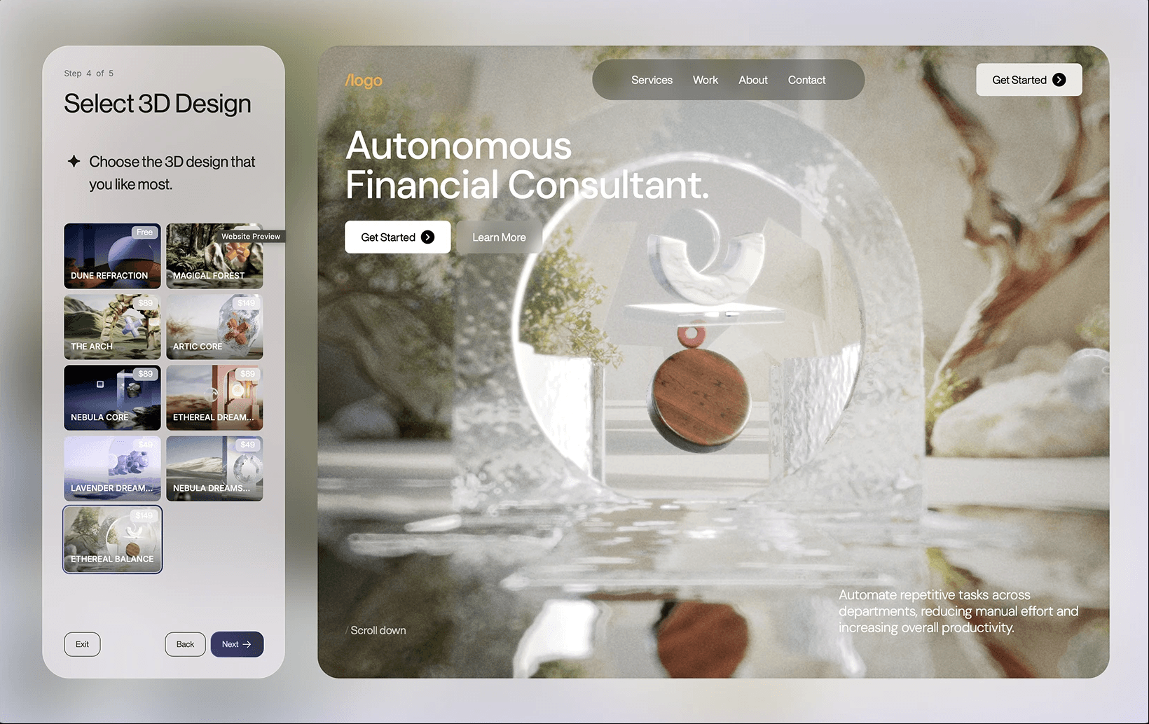
An empty builder combining 3D, motion, and layout is intimidating. AI was introduced to generate a first-pass website from a user's content — not a magic button, but an editable starting point.

The hard constraint: AI output had to behave like normal builder content. A beautiful locked result was worse than no AI at all. I also designed a prompt-based editing layer inside the builder — deliberately scoped to what the system could reliably interpret. Better to do less predictably than more unpredictably.


MY ROLE ON THIS DECISION

Designed the AI onboarding flow end-to-end and the prompt-based editing experience inside the builder.

Looking back, the most valuable skill I developed on PeachWeb was learning to distinguish between execution problems and framing problems. Most of the hardest work wasn't designing UI — it was deciding what the right question was before designing anything. The Anchors system is the clearest example: the solution looks simple in hindsight, but finding it required stepping back from "how do we fix the scroll timing" to "why is scroll the right unit of measurement at all."

Working with a designer-CEO also taught me something specific about operating in high-trust, high-ambiguity environments. The dynamic required me to be a strong executor on features he cared deeply about, while also being proactive enough to surface structural problems he wasn't looking for — like the page hierarchy issue, which he hadn't flagged as a priority. Navigating that balance without a design team to validate my thinking made me more rigorous about how I framed and documented my reasoning.


WHAT I'D DO DIFFERENTLY

Earlier and more structured user research. We were a small team moving fast, and I leaned heavily on the CEO-as-user for signal. That worked for some decisions and created blind spots for others. I'd push harder for even lightweight usage sessions with external users from the start.

AI Onboarding

AI onboarding helped users generate a structured starting point from their content, then personalize it through guided design choices.
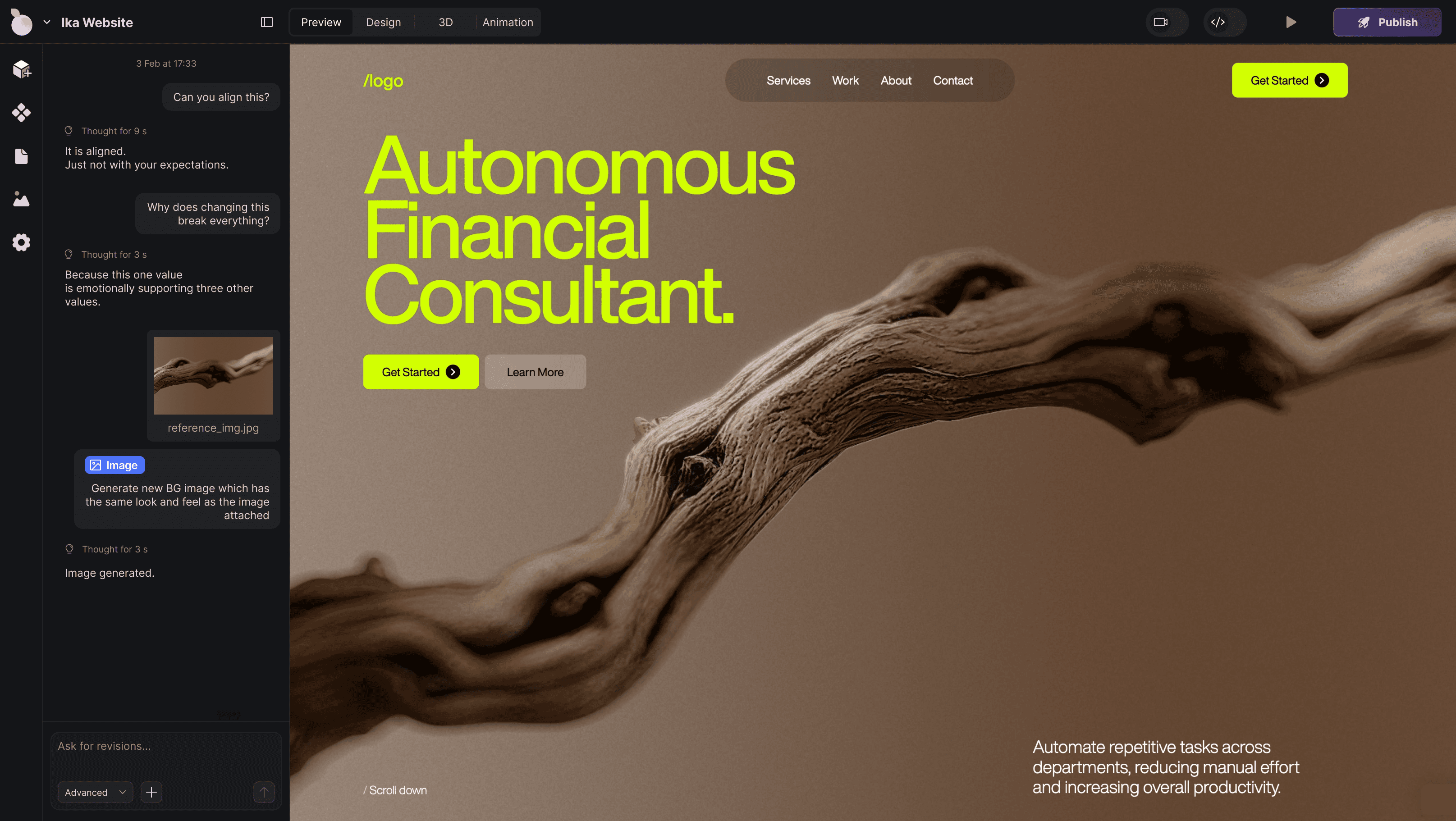
AI in builder

Prompt-based editing let users make targeted changes inside the builder without leaving the structured editing flow.

Reflection

Looking back, the most valuable skill I developed on PeachWeb was learning to distinguish between execution problems and framing problems. Most of the hardest work wasn't designing UI — it was deciding what the right question was before designing anything. The Anchors system is the clearest example: the solution looks simple in hindsight, but finding it required stepping back from "how do we fix the scroll timing" to "why is scroll the right unit of measurement at all."

Working with a designer-CEO also taught me something specific about operating in high-trust, high-ambiguity environments. The dynamic required me to be a strong executor on features he cared deeply about, while also being proactive enough to surface structural problems he wasn't looking for — like the page hierarchy issue, which he hadn't flagged as a priority. Navigating that balance without a design team to validate my thinking made me more rigorous about how I framed and documented my reasoning.


WHAT I'D DO DIFFERENTLY

Earlier and more structured user research. We were a small team moving fast, and I leaned heavily on the CEO-as-user for signal. That worked for some decisions and created blind spots for others. I'd push harder for even lightweight usage sessions with external users from the start.