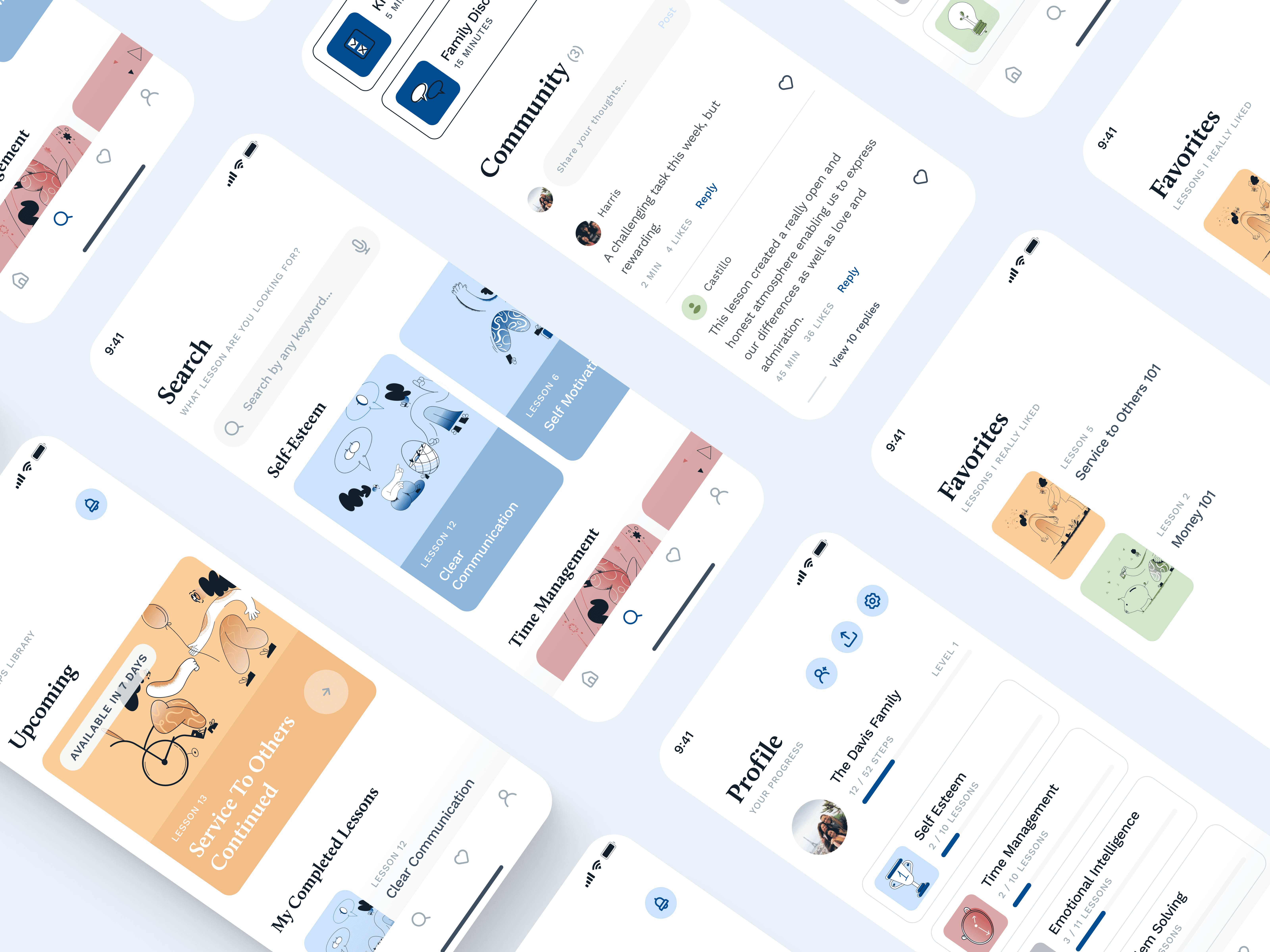
Safe Steps is a learning app where teenagers and parents progress together through shared lessons. Each experience combines video, reflection, and real-world discussion — turning soft skills into something practiced, not just taught. The goal of this work was to create a detailed, high-fidelity prototype to validate the concept and support investor discussions
UI & Product Designer
2021
The Challenge
One shared interface, two very different users — teenagers engaging with activities, parents guiding and tracking progress. The experience needed to feel motivating for teens without losing clarity for parents.
My Role
I worked alongside one colleague who led the discovery and research phase. I contributed to the VPC workshop and customer profiling, then owned the UI and final prototype end-to-end.
Designing for a Shared Experience
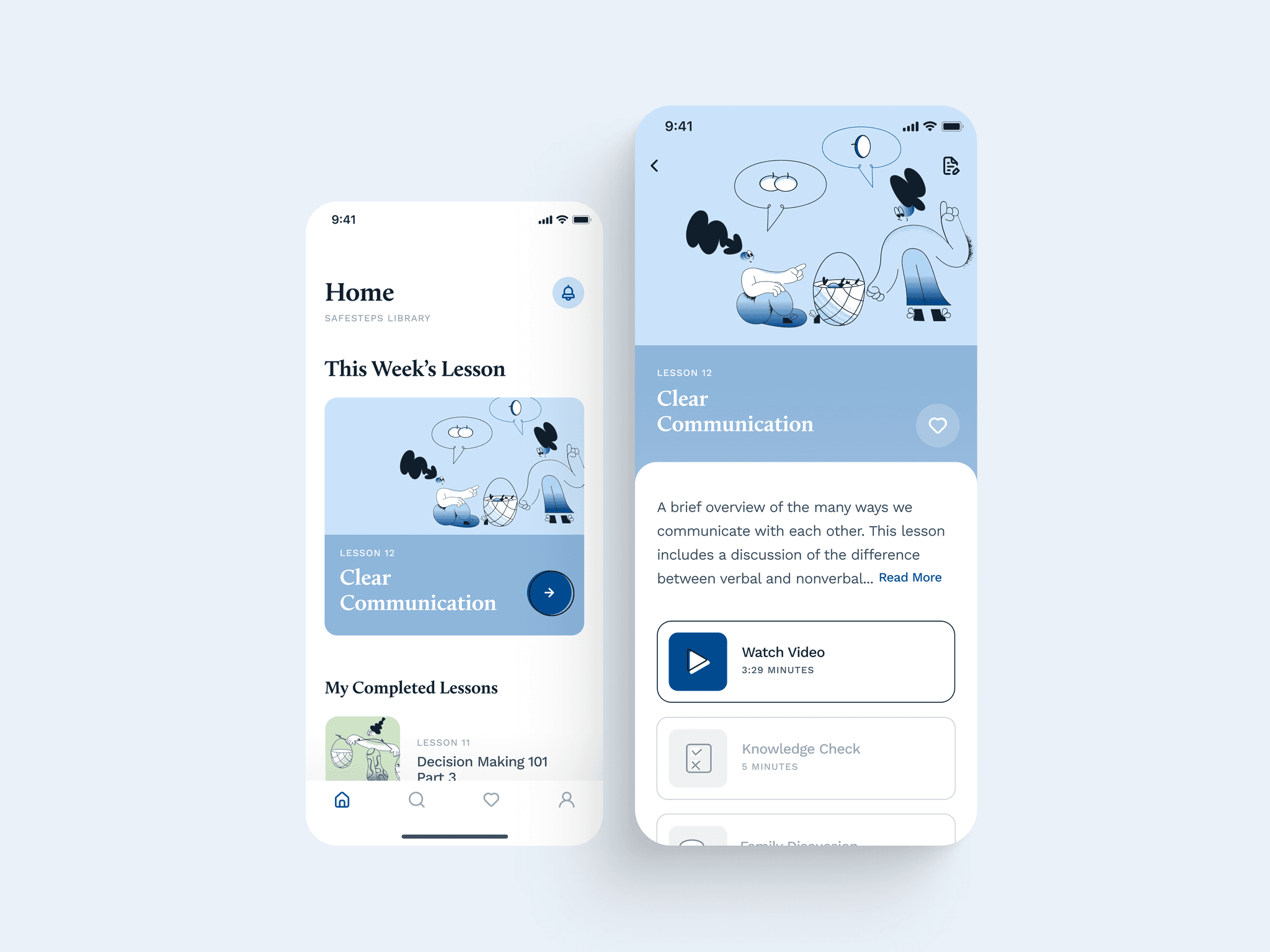
Lessons followed a four-stage flow: video → quiz → family discussion → community discussion. Each stage has a different emotional register — passive, reflective, intimate, shared — and the UI had to signal that shift without feeling like four separate apps.
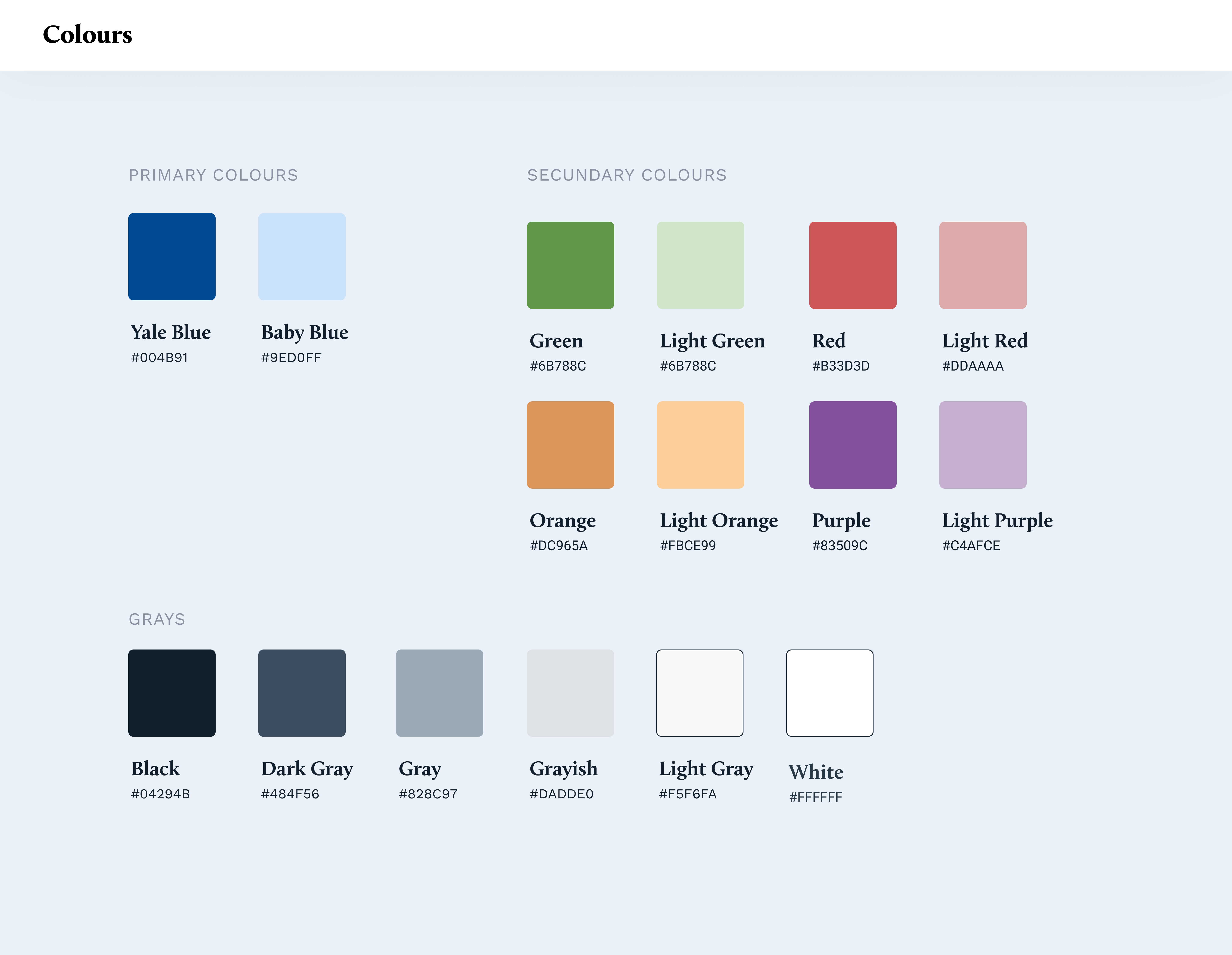
The hardest call was tone: warm enough for a 14-year-old, clear enough for a parent reviewing the same screen.
Illustration
Outcome
Delivered as a high-fidelity interactive prototype and promo video for investor and stakeholder presentations.